

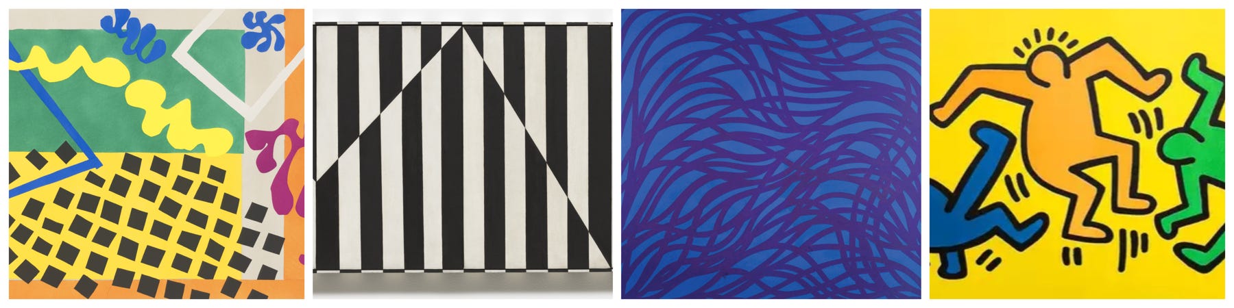
Color Theory
Sixteen intriguing wines exploring the yin-and-yang of color through their radiance, movement, and emotion captured by notable visual artists.

Color theory is the study of how colors interact: how they mix, match, contrast, and influence one another to create harmony, tension, and emotional impact.

At its core, color theory embodies three main ideas:
Color Wheel, or the visual map of primary (red, blue, yellow), secondary, and tertiary colors, showing their relationships;
Color Harmony, or how certain combinations (complementary, analogous, triadic, etc.) evoke balance or visual interest;
Color Context, or how perception of a color changes depending on what surrounds it (a red looks different next to black than next to pink).
However, beyond its formal structure, color theory can also be emotional and symbolic. Artists use it to evoke feeling. For example, cool tones can soothe, warm tones can energize, and high contrast can spark drama or movement. In a conceptual sense, and especially in the way one uses it, color theory becomes a metaphor for perception itself — how one element affects another, how balance is achieved through difference, and how emotion can be “composed” through hue, texture, and light.
📬 Email: Friendly reminder this will likely be cut off in your inbox! This particular newsletter will be best viewed via Substack app or in your preferred browser. Happy reading 🙏
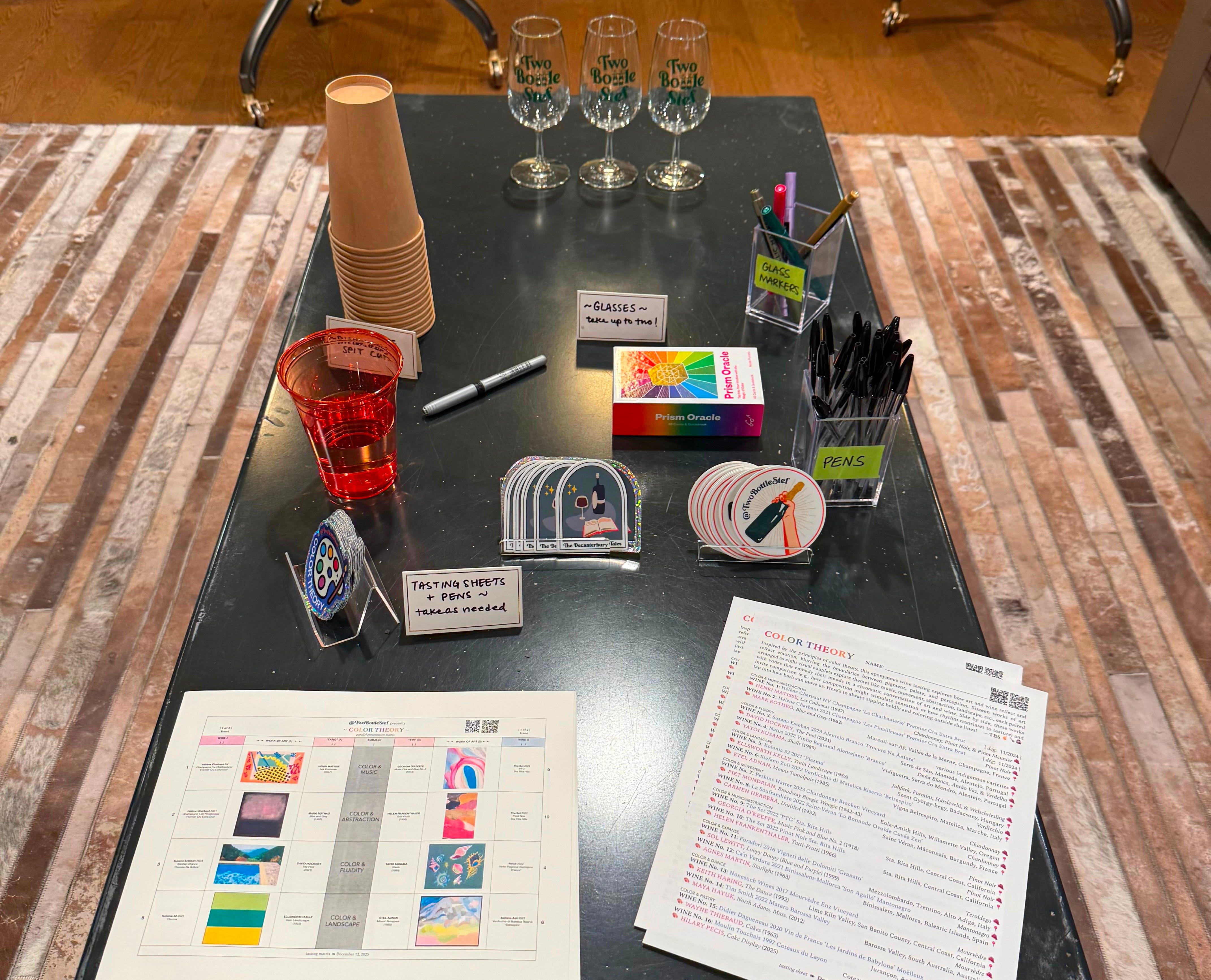
THE CONCEPT
Inspired by the principles of color theory (i.e., how hues interact to create balance, contrast, and thought), I curated an eponymous wine tasting to explore those same ideas through art and wine. Color Theory is a sensory study in color distilled through a tasting that blurs the boundaries among pigment, palate, and emotion. Through sixteen works of art arranged as eight visual couplets, each pairing explores a dialogue of hue and feeling, whether through music, fluidity, landscape, movement, abstraction, expanse, dance, or pastry.

Side by side, these works invite comparison (think: how composition might stimulate sensation or how rhythm translates to texture), with wine pairings that embody their moods. Together, they form a chromatic conversation about art, wine, and the ways both can move us.
Each visual couplet features both a male and a female artist, mirrored by a yin-and-yang pairing of winemakers, whose wines were chosen in parallel to the couplet’s underlying theme. These duos are designed to balance and challenge one another: contrasting energies in color, craft, and expression to reveal how harmony often emerges from tension as well as how art and wine alike find beauty in duality.
THE COLOR WHEEL
No. 1: Color & Music
This dual pairing examines how color and music translate onto canvas and paper, through Pinot-based blends, whether sparkling or still.
HENRI MATISSE
Artist Henri Matisse was a French Modernist celebrated for his bold use of color, expressive forms, and joyful compositions. A leading figure of Fauvism, he later pioneered his iconic paper cut-outs, creating vibrant works that embraced simplicity, movement, and emotional harmony.

An old French term tied to acrobatic performances, Les Codomas is one such cut-out, evoking the seamless motion of trapeze artists suspended in midair. Composed of looping, rhythmic forms in vivid color, it reflects Matisse’s late-career embrace of abstraction through cut paper. Created during wartime while he was recovering from illness, the work radiates lightness, freedom, and imaginative escape.
 from Jazz. 1947 | MoMA")
I first encountered this piece during my Saturday morning piano lessons as a child. My teacher often began our sessions with a few pages from Junior Hanon for the Piano, a renowned collection of exercises composed by Charles-Louis Hanon in the 19th century. These exercises are a cornerstone of classical piano training, widely used to build finger strength, speed, independence, and endurance. While I’m embarrassed to admit I wasn’t particularly good with the repetitive scales, the cover left a lasting impression, one I had remembered vividly, especially when I came upon it in real life during 2014 at the Museum of Modern Art.

It only made sense that I’ve long associated Les Codomas with color and music. This makes for an interesting coincidence, as it is part of Jazz, Matisse’s landmark portfolio of 20 color-stenciled prints (pochoirs) based on Matisse’s paper cut-outs published in 1947 by Tériade. The publication was accompanied by his handwritten notes in facsimile, combining image and text in a lyrical, book-like format with a theatrical spirit.
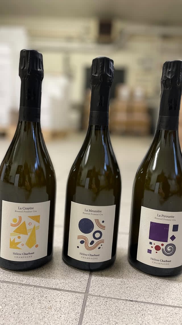
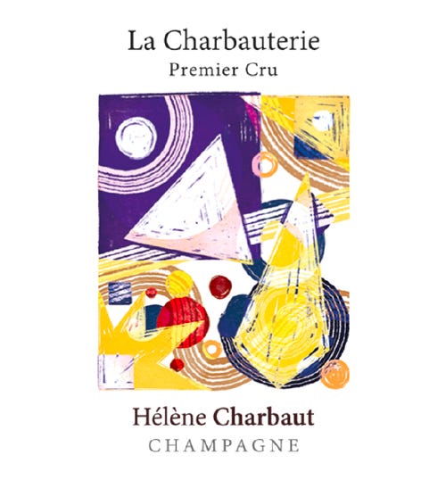
When I saw winemaker Hélène Charbaut’s wine labels, I immediately knew one would pair well with Les Codomas and another with a specific Mark Rothko piece (see here). La Charbauterie is a blend of roughly equal parts Chardonnay, Pinot Noir, and Pinot Meunier, with this label resulting from cleverly overlaying the respective images from her single varietal bottlings (see above) — the colorful chaos captured here mirrors the playful composition of Les Codomas as well as the profound character of Vallée de la Marne.
“Jazz is rhythm and meaning.”
—Henri Matisse
GEORGIA O’KEEFFE
Often called the mother of American Modernism, artist Georgia O’Keeffe was a pioneering American modernist painter. Known for her close-up depictions of flowers, sweeping desert landscapes, and stark architectural forms, her work fused abstraction with the natural world. O’Keeffe explored themes of scale, color, and form with bold simplicity and emotional depth. Much of her later work was inspired by the vast skies and terrain of New Mexico, where she lived for much of her life.

Music, Pink and Blue No. 2 reflects O’Keeffe’s interest in synesthesia, a neurological condition where the brain links one sense to another, causing an involuntary and automatic “crossing” of the senses — for her, it was the idea that color and shape can evoke the sensory experience of music. In this early abstract painting, soft, flowing shapes in shades of pink, blue, and violet move across the canvas like a visual symphony, evoking the rhythm and emotional resonance of music. The painting reflects O’Keeffe’s belief that art, like music, can express feeling without relying on literal representation — a sensual, synesthetic approach that would become a hallmark of her style.

As I wanted a similar yet distinct pairing of Les Codomas with La Charbauterie, I thought a still Pinot-based blend would present an interesting contrast. An initialism of passetoutgrain, The Set’s PTG is a 50/50 blend of Pinot Noir and Gamay, a nod to the traditional Bourgogne style of the same name. The 2022 vintage saw a heatwave in early September that compressed the picking window, imparting a green, resinous edge to the Gamay, a quality balanced in the final blend by the riper fruit of later-harvested Pinot Noir, much like the way contrasting tones in Music, Pink and Blue No. 2 resolve into a balanced visual (and implied aural) harmony. Additionally, the primary flavors of Pinot Noir and Gamay (think: a medley of red, blue, and violet fruits and flowers) match the palette of this painting, reinforcing the synesthetic resonance between taste and color.
“I found I could say things with color and shapes that I couldn't say any other way — things I had no words for.”
—Georgia O'Keeffe

No. 2: Color & Fluidity
This surveys how fluidity can be captured in paint and paralleled in the vineyard, specifically through the role of water (or its absence) in shaping Portuguese field blends made from white indigenous Alentejo varieties.
DAVID HOCKNEY
David Hockney is a British‑born artist whose career spans painting, drawing, printmaking, photography, set design, and digital media. Recognized as one of the most influential living artists of the 20th and 21st centuries, he rose to prominence in the 1960s during the Pop Art movement. Hockney is widely known for his vibrant depictions of Californian swimming pools as well as for his interest in perception, color, and light, and his willingness to experiment with media and technique throughout his career.

Hockney’s The Pool (2021) embraces the hallmark themes of his long‑standing fascination: light, water, architecture, and place. Set in Los Angeles, the composition features a shimmering blue pool, sunlit green hills, and a sense of serene emptiness. He described his work on the painting as “marvelous…. really thrilling,” reflecting the intensity with which he pursued this piece. Though echoing his earlier iconic pool paintings, The Pool (2021) brings them into a later stage of the artist’s vision: the clarity of color, the flatness of space, and the calm presence of water all fuse into a contemplative image of place, memory and light.

Winemaker Susana Esteban’s Procura Na Ânfora Branco is crafted from very old, dry-farmed vines rooted high on the Serra de São Mamede at 700 meters elevation in Portugal’s Alentejo region. Vinified with minimal intervention and aged for eight months in ânforas (clay amphorae), the wine emphasizes texture, minerality, and freshness over opulence, allowing the vineyard’s identity to take center stage.
Much like Hockney’s The Pool (2021), which captures the shimmering stillness and rhythmic movement of water through Los Angeles light and geometry, this white field blend conveys a similar sense of fluidity and tension. It’s a liquid landscape shaped not by control, but by elevation, soil, and time: a precise composition drawn by nature, not ornament.
“I prefer living in color.”
—David Hockney
YAYOI KUSAMA
Yayoi Kusama is a trailblazing contemporary artist whose work spans painting, sculpture, installation, performance and writing. Her art is marked by obsessive repetition, vibrant color, polka dots, nets, pumpkins, and mirrored environments. These elements reflect her lifelong fascination with infinity, self‑obliteration, and immersive experience. Kusama’s themes often draw on her own childhood hallucinations and struggles, turning psychological intensity into visually joyous, often surreal expressions.

Shells (1989) is a limited-edition silkscreen print by Kusama, featuring stylized shell forms set against a patterned, tessellated backdrop. Rendered in bright, saturated colors and marked by her signature dot motif, the organic forms are transformed into abstract, rhythmic repetitions. The work reflects Kusama’s fascination with the interplay of micro and macro scales: natural objects distilled through pattern into something both intimate and infinite. While shells are a departure from her pumpkins, flowers, and nets, they remain part of her broader dialogue with nature, here expressed in a more contemplative register.
 1989 | For Sale")
Vinified by Natus, this white field blend hails from the foothills of the Serra do Mendro in Vidigueira, a subregion of Portugal’s Alentejo. Made primarily from native varieties of Roupeiro, Antão Vaz, and Verdelho (Gouveio), the wine opens with citrus and pulpy stone fruit on the nose. The palate reveals lively acidity, subtle tannins from partial skin contact, and a clean, mineral-driven finish. Grown on sandy loam soils, the vines benefit from excellent drainage, promoting healthy stress and concentration in the fruit.
Much like Shells, which transforms organic forms into meditative, flowing rhythms, this wine reflects a similar fluidity shaped by its environment. Its tension, clarity, and layered texture mimic the subtle movement and repetition that define Kusama’s work, a shared expression of how natural forces, whether in soil or on paper, can be distilled into something elemental and enduring.
“Our earth is only one polka dot among a million stars in the cosmos.”
—Yayoi Kusama
No. 3: Color & Landscape
ELLSWORTH KELLY
Ellsworth Kelly was an American artist who played a key role in the shift toward abstraction and minimalism in mid‑20th‑century art. Known for his strong sense of color, line, and shape, Kelly embodied a stripped-down aesthetic. Rather than depicting recognizable objects, he reduced painting to its essentials: form, surface, and viewer interaction. He was deeply interested in the way the eye perceives color and space, often transforming everyday visual experiences (e.g., windows, architectural signage, or landscapes seen from a moving train) into pure abstractions.

Train Landscape was painted while Kelly lived in Paris. The title derives from a fleeting view he observed from a speeding train: fields of lettuce, spinach, and mustard blurring into great swaths of green and yellow. The work is a triptych of joined panels, with bold, flat color fields that abstract nature into visual rhythm. Rather than a literal depiction, the painting offers a distilled sensation of landscape: shape, hue, and spatial tension become the subject. In Train Landscape, Kelly transforms a passing moment into a stable, meditative object — an exercise in how color and form alone can evoke place, motion, and memory.

Like the lush green forms in Train Landscape, Kolonia 52’s Plazma captures the vivid energy of nature through a blend of indigenous Hungarian white grapes. Some are direct-pressed (Juhfark), while others see a few days of skin contact (Furmint, Hárslevelű, and Welschriesling), adding texture and nuance. These varieties often express green and yellow notes (think: citrus, orchard fruit, herbal tones), making the wine an apt analog to Kelly’s composition, where color and shape echo the natural landscape without literal depiction.
“I’m interested in the space between the viewer and the canvas. That field that activates the painting.”
—Ellsworth Kelly
ETEL ADNAN
Etel Adnan was a Lebanese‑American poet, essayist, and visual artist whose career spanned continents and disciplines. Born in Beirut then educated in Europe and the United States, she ultimately settled in California, where the landscape, especially Mount Tamalpais, became a recurring muse. In her paintings, writing, and tapestries, she transformed memory, place, and emotion into luminous abstractions, using color and form to evoke inner landscapes as much as external ones. Her artistic philosophy rejected mere representation; instead, she saw painting as a language of feeling — a way to express what words sometimes cannot.

Adnan’s Mount Tamalpais, now housed in the Sursock Museum in Beirut, abstracts the California mountain into a meditative interplay of color and form. Using soft blues, grays, and earth tones punctuated by pastel greens, pinks, and yellows, Adnan evokes sky, rock, and valley without literal representation. For her, the mountain becomes more than landscape: it is a vessel for memory, perception, and inner stillness. Through flattened shapes and delicate rhythms, she distills geography into emotion, offering a visual language that feels both timeless and intimate.
 | Artsy")
Winemaker Stefano Zoli’s Belrespiro, made from old-vine Verdicchio in Italy’s high-altitude Matelica zone, underscores this ethos of clarity and restraint. Fermented with native yeasts, aged in a mix of concrete and ceramic vessels, and free from malolactic conversion, the wine offers electric acidity, orchard fruit brightness, and a tactile, mineral tension. It’s Zoli’s answer to a “Chablis of Italy”: a wine that is precise, expressive, and deeply site-specific.
Both Adnan and Zoli work within minimalist frameworks to evoke expansive emotion. Just as Mount Tamalpais translates landscape into nostalgic abstraction, Belrespiro transforms vineyard and vintage into a pure, light-driven composition. Each rewards attention not through overt complexity but through simplified beauty, capturing presence with reverent simplicity.
“Mount Tamalpais became my center, my source, my territory. It taught me how to paint, and how to look.”
—Etel Adnan
No. 4: Color & Movement
This dual pairing showcases how color can shape and depict movement, whether through primary colors or monochrome scheme, alongside Old versus New World Chardonnays.
PIET MONDRIAN
Artist Piet Mondrian was a Dutch modernist painter and a key figure in the De Stijl movement, which sought to reduce visual art to its purest elements: line, color, and form. Over time, he moved from representational painting to a highly abstract, geometric style called neoplasticism, using grids of black lines and blocks of primary colors (red, blue, yellow) with white and gray. He believed this visual language expressed universal harmony and spiritual order.

Inspired by the energy of New York City and the syncopated rhythms of boogie-woogie jazz, Broadway Boogie Woogie was Mondrian’s final and most dynamic painting. Replacing his signature black lines with vibrant grids of yellow, red, blue, and grey rectangles, Mondrian transforms the city’s street grid into a lively visual composition. The painting pulses with motion evoking both the structure of Manhattan and the improvisational spirit of music — a joyful celebration of modern life in motion.

This Chardonnay bottling from Perkins Harter comes from Bracken Vineyard in the Eola-Amity Hills AVA, perched at elevations between 630 and 750 feet with sweeping views of the Willamette Valley. The soils, primarily volcanic in origin, including Nekia, Ritner, Witzel, and Jory series, allow for excellent drainage and mineral expression. The vineyard is planted to Pinot Noir and Chardonnay, with recent additions of Aligoté and Pinot Meunier, and emphasizes clonal diversity to foreground terroir over single-clone identity. Whether through elevation, soil variation, or clonal nuance, the site’s multi-dimensional character is akin to the pulsing, layered complexity of Mondrian’s Broadway Boogie Woogie.
“The rhythm of relations of color and size makes the absolute appear in the relativity of time and space.”
—Piet Mondrian
CARMEN HERRERA
Artist Carmen Herrera was a Cuban American painter and one of the earliest pioneers of geometric abstraction. Though she worked for decades in relative obscurity, she gained major recognition later in life, with her first major solo exhibition coming at age 89. Her work is characterized by crisp lines, bold color fields, and a focus on symmetry, balance, and minimalist precision. She often distilled her compositions down to their most essential visual elements, engaging with the principles of Constructivism and Hard-Edge painting long before these movements were widely recognized.

Untitled (1952) is a striking example of Herrera’s early geometric abstraction, characterized by clean lines, sharp contrasts, and minimalist form. Composed of carefully balanced black and white planes, the painting reflects her pursuit of visual clarity and formal discipline. Created during her time in postwar Paris, the work embodies her lifelong commitment to reducing composition to its essential element — a radical act of restraint that quietly challenged dominant art narratives of the time.

White Burgundies from Mâconnais, including La Bonnode Ovoïde from La Soufrandière’s Cuvée Zen series, often express Chardonnay with clarity, precision, and freshness, rather than overt opulence. Marked by clean acidity, mineral backbone, and minimal to no new oak, these wines express a linear elegance that echoes the dynamic totality of Herrera’s Untitled (1952). Both are deceptively simple yet meticulously crafted, their restraint revealing a quiet intensity, whether through vineyard discipline or the rigor of hard-edged abstraction.
“I never met a straight line I did not like.”
—Carmen Herrera
No. 5: Color & Abstraction
This considers how color and abstraction work hand-in-hand, revealing the emotional range possible when form is distilled and color becomes the primary mode of communication. As a counterpart to Color & Music, this treatise of Color & Abstraction grants something in parallel, this time featuring single varietal bottlings of Pinot Noir, both sparkling and still, from the same producers: Hélène Charbaut and The Set.
MARK ROTHKO
Mark Rothko was a Russian‑born American painter and a key figure of the Color Field movement within Abstract Expressionism. He is best known for his large‑scale canvases featuring expansive, softened rectangles of color designed to evoke deep emotion, spiritual reflection, and the sublime. Rothko believed that painting could transcend representation and touch the viewer directly — he once remarked that his paintings make the viewer feel “enveloped within” the fields of color.

Rothko’s poignant Blue and Gray (1962) typifies his mature style. The composition features two major horizontal fields: a mist‑softened grey rectangle above a deeper, dense blue slab, each with softly feathered edges that seem to hover and breathe. The subtle tension between the upper light zone and the lower saturated mass, combined with the immersive size of the painting (approximately 6.3 feet x 5.7 feet), invites the viewer into a space of silent contemplation. Rather than depicting objects or narratives, the work uses pure chromatic form as an exploration of color as a vessel for feeling — to evoke emotion, stillness, and the unfathomable.

As mentioned earlier, I strongly felt the label for Les Pinailleuses was meant to paired with Rothko’s Blue and Grey (1962). This Premier Cru Extra Brut Champagne is made from 100% Pinot Noir sourced from old-vine parcels in the villages of Bisseuil, Vieuil, and Mareuil‑sur‑Aÿ. Its name, loosely translated as the ‘nitpickers’ or ‘fussers’, reflects winemaker Hélène Charbaut’s meticulous approach. Every detail is considered, every selection precise, resulting in a Champagne that rewards close attention over indulgence. Its elegance, clarity, and quiet tension in the glass mirror both the calcareous soils of its origin and her refined, expressive style.

The label design subtly echoes the spirit of Blue and Grey through its minimal palette and soft, abstract washes. Both works embrace space and restraint, using nuanced fields of color to evoke contemplation rather than spectacle. Just as Rothko’s layered rectangles hover between presence and absence, Charbaut’s label offers a sense of motion and depth through near-imperceptible texture: a visual whisper rather than a shout. Together, this wine and artwork form a dialogue of stillness and discipline.
“A painting is not a picture of an experience; it is an experience.”
—Mark Rothko
HELEN FRANKENTHALER
An American painter whose pioneering work in the 1950s and beyond Helen Frankenthaler, like Rothko, helped to shape the Color Field movement within Abstract Expressionism. She developed a signature soak‑stain technique, pouring thinned paint onto unprimed canvas so that pigment would soak into the surface, creating luminous fields of color that blur the boundary between drawing and painting. Her work is celebrated for its lyrical abstraction, refined control of color, and ability to evoke emotion and space through seemingly simple means.

Created by Frankenthaler in 1966, Tutti‑Frutti is an expansive acrylic on canvas measuring 9.7 feet by 5.7 feet. In this work, large swaths of saturated color wash across the canvas in broad, fluid gestures, their edges soft and the transitions between hues organic and spontaneous. The effect is one of vibrant motion and calm at once: colors seem to float and overlap, forming a rhythm of forms without distinct outlines or figurative reference. Tutti‑Frutti exemplifies Frankenthaler’s mastery of abstraction by using color itself as subject, creating a space of visual immersion that invites the viewer to experience color as sensation rather than representation.

These two single-varietal Pinot Noir bottlings (i.e., the aforementioned sparkling from Charbaut and this still one from The Set) were thoughtfully paired with works of visual abstraction that evoke the feeling of painting without rules. Yet beneath their apparent spontaneity, both wines are grounded in structure and intention. Charbaut’s Champagne reflects rigorous vineyard and cellar practices: old-vine sourcing, minimal intervention, and traditional élevage via méthode champenoise. The Set’s still Pinot similarly reveals a precise hand, from its clonal blending philosophy to its fermentation choices — even its label design reflects plotted precision.
Like the artworks they accompany, these wines feel alive, open-ended, and improvisational, yet they emerge from deeply considered frameworks. This tension mirrors the abstract work of Rothko and Frankenthaler which reject representation while adhering to internal rules of color, composition, and rhythm. The illusion of freedom, in both cases, is built upon discipline: once the rules are internalized, they can be transcended. Tutti-Frutti especially captures this duality, with its diaphanous, color-washed surface reflecting the wine’s own brightness and energy from a challenging vintage marked by heat and ripeness.
“I don’t start with a color order, but find the colors as I go.”
—Helen Frankenthaler
No. 6: Color & Expanse
Color, at its most expressive, can evoke not just mood or tone, but scale: stretching beyond the frame to suggest vastness, depth, and the unknown. In this section, we explore how artists use color as a vehicle for the expanse: to conjure space, silence, immensity, and emotional reach without ever depicting a horizon.
SOL LEWITT
Sol LeWitt was a pivotal figure in both Conceptual Art and Minimalism. He famously argued that the idea (i.e., the concept behind an artwork) could be more essential than its physical execution. Many of his most celebrated works are wall drawings created from his own instructions, often carried out by others, embodying a system where structure and play co‑exist.

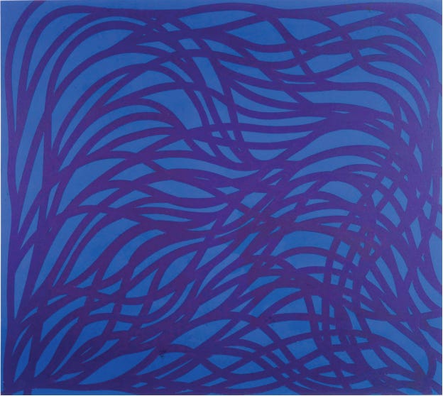
Installed in the atrium of the Conrad New York Downtown hotel, LeWitt’s Loopy Doopy (Blue and Purple) spans thirteen stories with undulating loops of royal blue and vibrant purple set across a monumental scale.

Executed from panels created in sections at the Brooklyn Navy Yard, the work required more than 3,000 hours of fabrication and over 100 gallons of paint. The curving lines and repetitive rhythm embody LeWitt’s interest in rule‑based systems, yet the result appears playful and organic: an extended field where form, color and space merge to invite visual immersion.
The concept of the expanse is ultimately about light stretching beyond reach, sometimes disappearing into silence, shadow, or oblivion. In the wine world, that same sense of loss hovers around indigenous grape varieties teetering on extinction, tacitly fading from cultivation and cultural memory. But stewards like Elisabetta Foradori defy that dwindling, especially through her championing of Teroldego and other native Italian grapes — she shows how intention and care can rescue a variety from obscurity.
The swirling blue and purple hues of Loopy Doopy conjure the vibrant fruit profile of Teroldego (think: blueberry, plum, and black raspberry), while LeWitt’s looping composition resembles the pergola-trained vines of Campo Rotaliano, where the sun-soaked grapes for Granato are grown. Just as bold color can reclaim a canvas from darkness, the once nearly forgotten Teroldego is brought back into the light through place-driven winemaking. The expanse, then, becomes not a vanishing sight, but a reclamation: of light, of legacy, and of the stories we choose to preserve.
“Obviously a drawing of a person is not a real person, but a drawing of a line is a real line.”
—Sol LeWitt
AGNES MARTIN
Agnes Martin was a Canadian‑American painter whose meditative abstractions helped pave the way for Minimalism, though she preferred to think of herself as an Abstract Expressionist. Based on subtle color fields, hand‑drawn grids, and expressions of stillness and transcendence, her signature aesthetic reflects her lifelong interest in spirituality, perfection, and inner calm.

Comprised of watercolor and ink on paper, Starlight features a rich, lustrous field of blue wash overlaid with a delicate hand‑drawn grid, the thin ink lines trembling slightly by the artist’s hand yet retaining geometric order. The soft expanse of color suggests sky or sea (or perhaps starlight itself), while the grid delineates subtle structure. Martin’s restraint and precision invite the viewer into contemplation, where abstraction becomes an emotional and spiritual experience rather than mere form.

As Christie’s had noted, Starlight captures the awe-inspiring vastness of the night sky and the delicate glow of distant stars, all without resorting to direct representation. In a similarly poetic mode, Ca’n Verdura’s Son Agulló offers an ultra-elegant expression of Mantonegro from a singular, old-vine parcel called Plà de Buc. This limited-production wine serves as a window into a bygone era of Mallorcan viticulture. Winemaker Tomeu Llabrés practices minimal intervention in the cellar and low-impact viticulture in the vineyard, maintaining native cover crops during the colder months to foster biodiversity and a thriving polyculture. Like Martin’s work, which sought to distill transcendence through elemental forms, Son Agulló is a kindred revelation, grounded in nature, shaped by intention, and resonant with the subtle beauty of what endures.
“My paintings are not about what is seen. They are about what is known forever in the mind.”
—Agnes Martin
No. 7: Color & Dance
This pairs two distinct depictions of dance on canvas with two expressions of Mourvèdre from opposite hemispheres and climates: one restrained and composed, the other bold and unbridled.
KEITH HARING
Keith Haring was an American artist whose bold graphic style emerged from the New York City street‑art scene in the early 1980s. His energetic figures, thick black outlines and vibrant colors became a visual language of pop art and activism, tackling themes like social justice, sexual identity and the AIDS crisis with a spirit of accessibility and urgency.

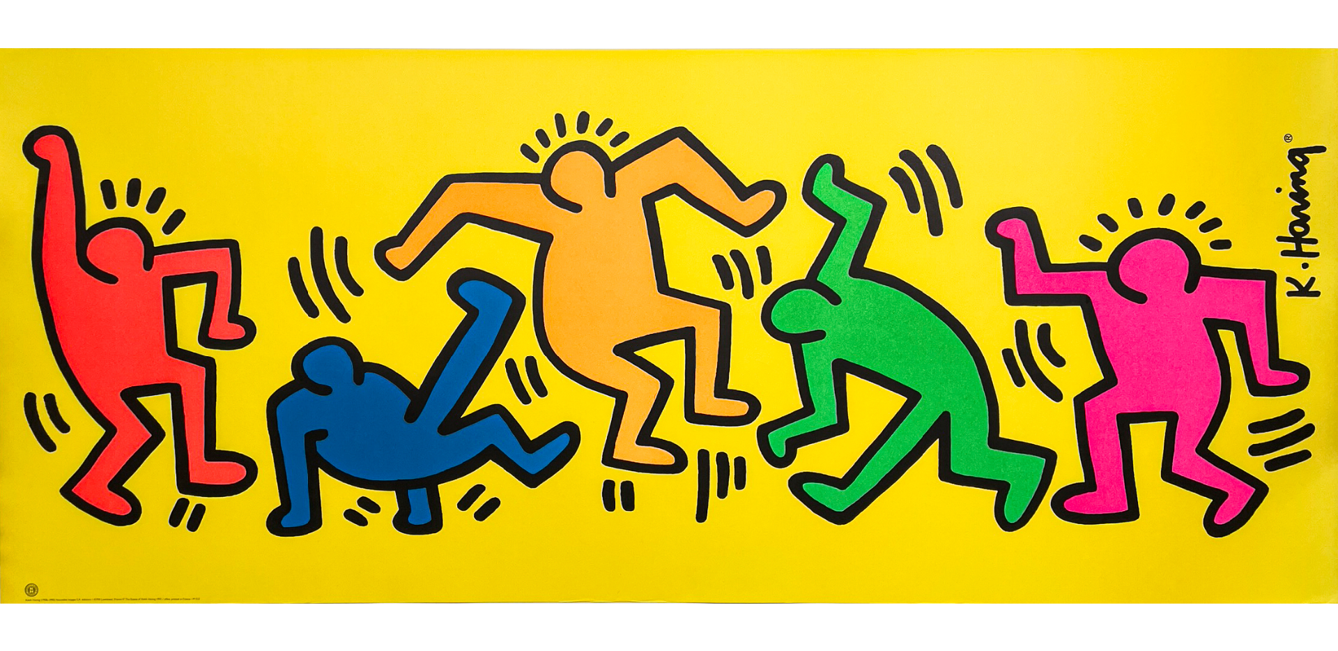
Originally commissioned as part of his studio’s legacy editions, The Dance (1992) is a large-format offset lithograph by Haring that bursts with vitality. Against a bright yellow background, five stylized figures move in sync, outlined in thick black and filled with bold primary colors. Their fluid, rhythmic poses and Haring’s signature “movement lines” evoke the joy and communal urgency of dance. Beneath its playful simplicity lies a deeper intent: to make art immediate, accessible, and energetically alive. The Dance stands as a celebration of motion, connection, and the democratic spirit of art.
Similarly, this Mourvèdre from Nonesuch Wines channels both power and precision. Sourced from organically farmed, dry-farmed vines planted in the 1920s at the historic Enz Vineyard in California’s Lime Kiln Valley, it is grown on granite- and limestone-rich loam soils that imbue the wine with character and restraint. At just 12.6% ABV, it favors structure over richness, with bright red fruits layered over dusty earth and cool minerality. The palate is taut and composed, offering lean meatiness, firm tannins, and peppery lift with a citrus-spiced finish.
This wine is less about hedonism and more about restraint, tension, and precision — a study in controlled energy, seen similarly in Haring’s The Dance (1992). Its visual rhythm has the wine’s kinetic energy, grounded by clarity and form. Both the wine and the artwork balance motion and stillness, celebrating discipline over exuberance, and revealing how minimalism can still express vitality when composition is intentional.
“Art should be something that liberates your soul, provokes the imagination and encourages people to go further.”
—Keith Haring
MAYA HAYUK
Maya Hayuk is a Brooklyn‑based artist celebrated for her bold, large‑scale murals and vivid abstract compositions. Her work often merges references from folk craft (e.g., pysanka eggs and Ukrainian embroidery) with cosmic and psychedelic imagery, creating dense, patterned surfaces alive with color and rhythm.

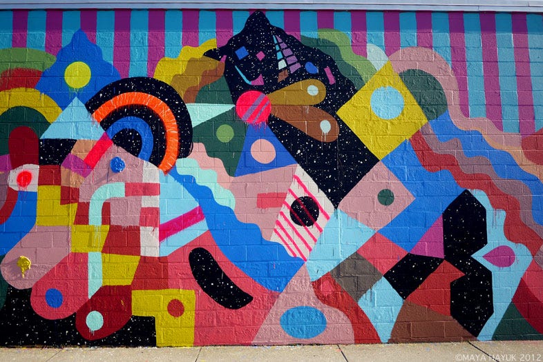
As part of the DownStreet Art initiative in North Adams, Massachusetts, Hayuk unveiled this vibrant mural in 2012. The work wraps a building in bright stripes and kaleidoscopic forms: swirling arcs, layered triangles, and repeated dot motifs fuse into a dynamic visual field. The mural captures Hayuk’s signature ability to transform urban architecture into a rhythmic tapestry of color and pattern, inviting engagement, movement, and visual immersion.
This Barossa Valley Mataro from Tim Smith is a vivid, full-throttle expression of old-vine Mourvèdre sourced from two historic sites: one nearly 140 years old, the other around 70. Fermented and matured in large-format French puncheons, the wine prioritizes varietal purity and site expression over oak influence. It bursts with dark notes of rhubarb, licorice, wild herbs, and blue florals, all framed by firm structure and vibrant energy. Its bold, layered, and unapologetically expressive character mirrors the spirit of Hayuk’s 2012 mural in North Adams, which transforms architecture into a kaleidoscope of dance and saturated color. Like her immersive façade, this wine rejects restraint in favor of dynamic intensity, a sensory experience that commands attention and rewards exploration.
“I like free-handing with precision, but with an invitation for the materials to dictate a level of chance. In other words, it’s essential for me to have a balance of control / lack of control.”
—Maya Hayuk
No. 8: Color & Pastry
This outlines how two painted interpretations of pastry can be thoughtfully paired with two distinct dessert winemaking methods.
WAYNE THIEBAUD
Wayne Thiebaud was an American painter best known for his vibrant depictions of everyday objects (think: pies, cakes, gumball machines, lipsticks, and deli counters) rendered in thick, textured paint with bold color contrasts and exaggerated shadows. Though often associated with Pop Art, Thiebaud preferred to be viewed through the lens of American Realism and figurative painting, citing influences from classical still life to cartooning. His work is known for its clarity, wit, and nostalgic charm, often elevating the ordinary to the iconic.

Thiebaud’s Cakes (1963) presents a grid of frosted confections rendered in thick, sculptural oil paint. With its playful subject, clean geometry, and pastel palette, the work evokes the charm of a bakery display while subtly exploring themes of desire, repetition, and nostalgia. Each cake stands alone yet belongs to the whole: a celebration of form, light, and the comforting poetry of the everyday.

Didier Dagueneau’s Les Jardins de Babylone Moëlleux is a rare and exquisite sweet wine expression crafted from Petit Manseng in the steep, biodynamically‑farmed hillside vineyards of the Jurançon region in Sud-Ouest. The wine invites an elegant interplay of lush sweetness and racy acidity, with aromas of candied citrus peel, dried pineapple, and acacia honey, followed by a silky yet vibrant palate framed by fresh ginger, preserved lemon and a clean, mineral‑driven finish. Farmed on blue‑slate terraces, hand‑harvested with careful selection for botrytis development, and elevated by Dagueneau’s precision and glass‑mountain terroir, this wine embodies concentrated finesse, age‑worthy structure, and graceful richness, not unlike Cakes here, all in its bold, inviting glory.
“As far as I'm concerned, there is only one study and that is the way in which things relate to one another.”
—Wayne Thiebaud
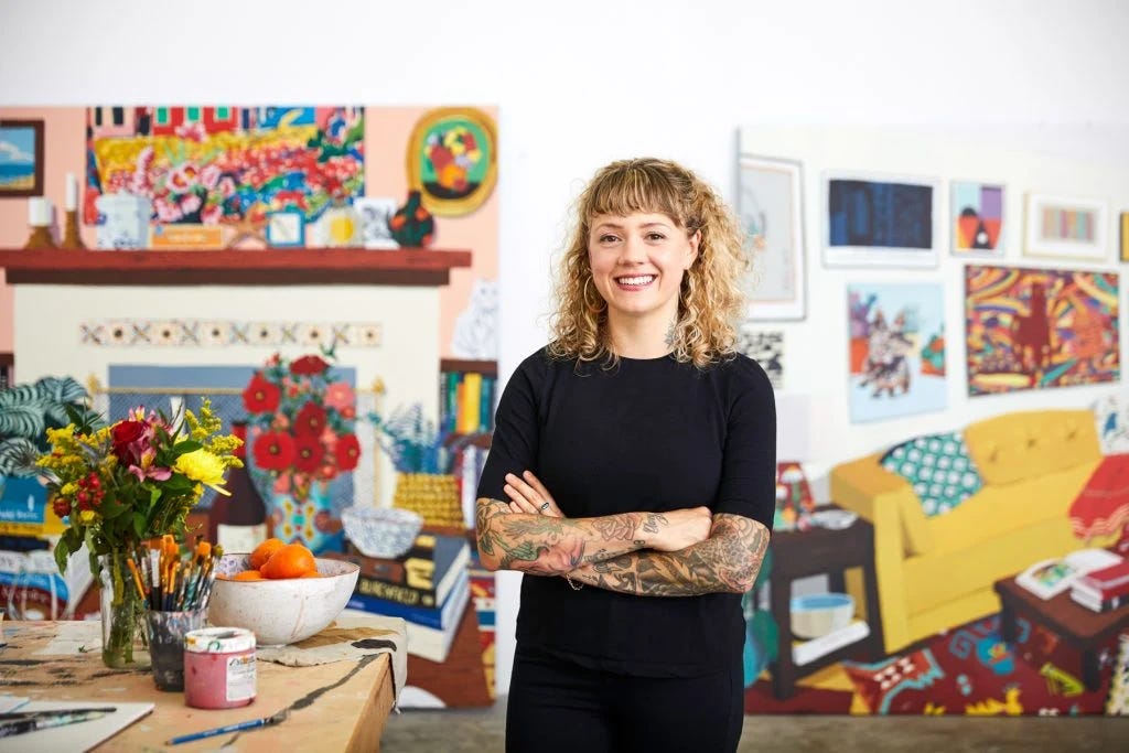
HILARY PECIS
Hilary Pecis is a Los Angeles–based painter whose vibrant still lifes, interiors, and urban landscapes elevate the everyday into moments of visual poetry. Working primarily in acrylic on linen, she transforms scenes drawn from her photography, whether a doorstop, a vendor stand or a domestic shelf, into kaleidoscopic compositions rich in color, pattern and small narrative details.
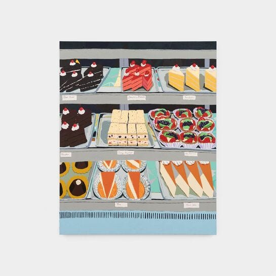
Completed in 2025, Bakery Display is a large‑format acrylic on linen in which Pecis depicts rows of pastries: layered cakes, tarts, whipped cream dollops, cherries — all neatly arranged behind a display case. The work pays homage to the visual tradition of dessert still‑lifes (drawing a subtle nod to Thiebaud) while retaining Pecis’s distinct sensibility: a flattened perspective, carefully calibrated color, and attention to the details of everyday display (e.g., the ventilation slits of the cooler). In Bakery Display, Pecis invites the viewer to linger on the familiar, and thus transformed, scene of a pastry case. The work fuses domestic intimacy with the polished spectacle of retail display, exploring how ordinariness becomes aesthetic when reframed.
Moulin Touchais’s 1997 Coteaux du Layon is a refined expression of Chenin Blanc grown on schist and limestone slopes along the Layon River in Anjou. Founded in 1787, the estate is known for its rare long-aging philosophy: wines are released only after at least 10 years in bottle, allowing them to develop their hallmark balance of complexity and freshness. The 1997 vintage, one of the decade’s standouts, benefited from ideal botrytis and late-harvest conditions, amplified by the domaine’s practice of picking some fruit early for acidity and some late for richness. The result is a beautifully poised wine, marrying honeyed depth, supple texture, and vivid acidity, meant for contemplation, especially alongside Pecis’s Bakery Display.
“I think of painting as an endurance activity, a series of small movements that add up to a finished piece.”
—Hilary Pecis

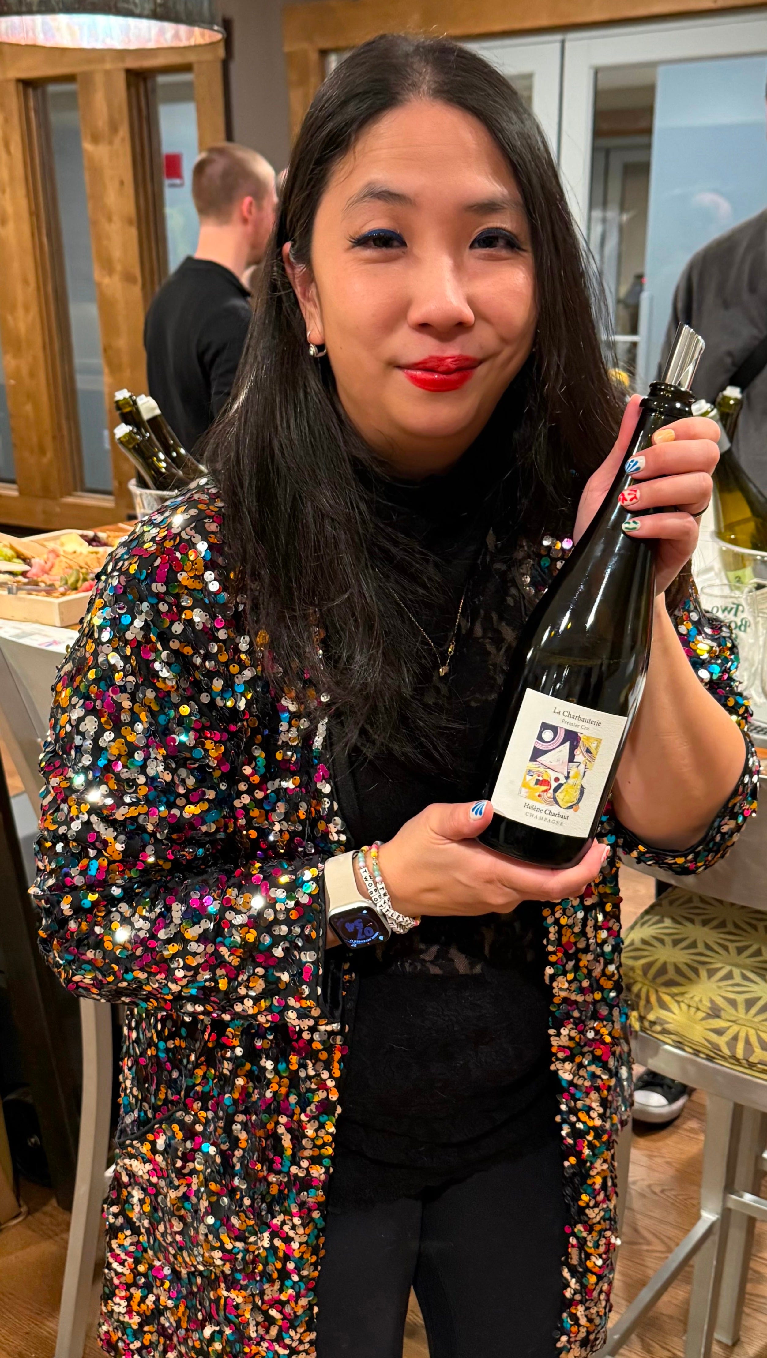
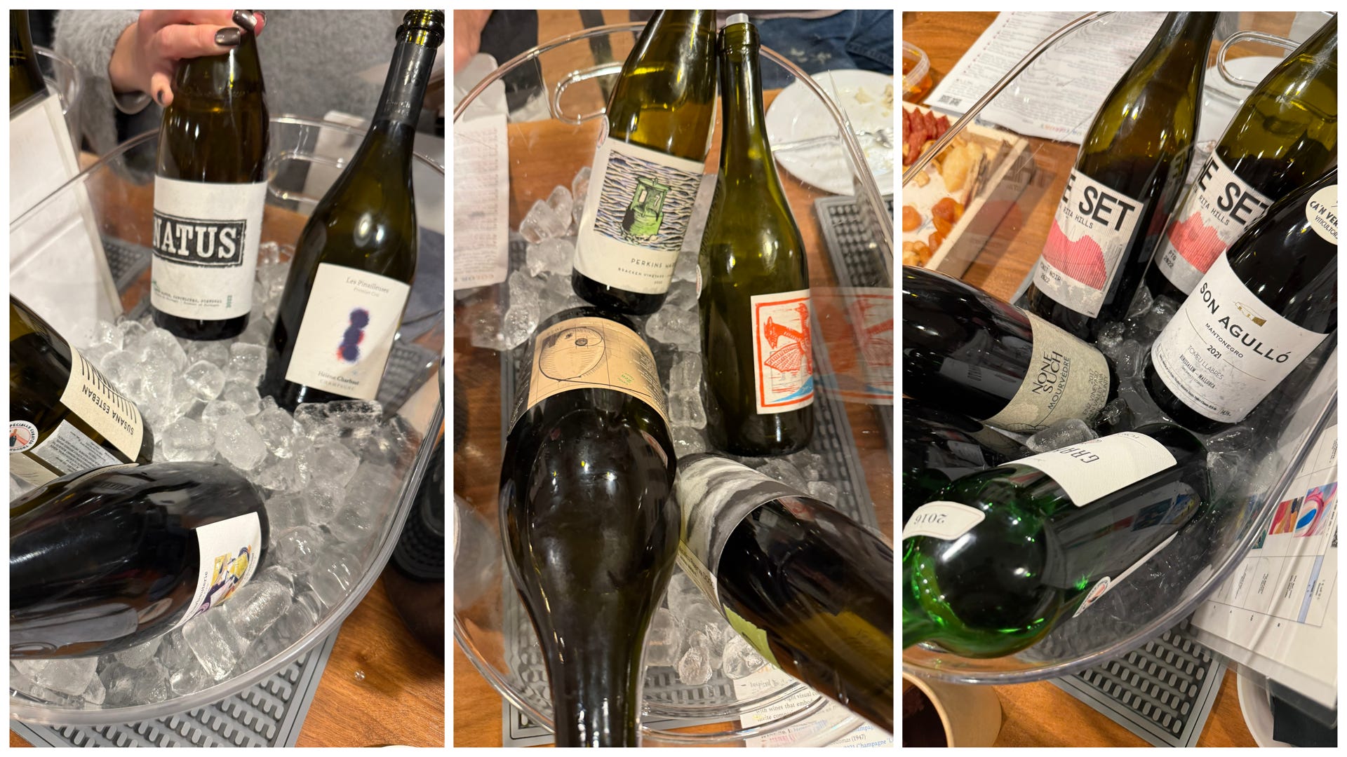
Yesterday marked a very important day, not only because this Color Theory tasting finally came to fruition (more on this shortly), but because my spankin’ new Two Bottle Stef glassware made its dazzling debut.
It was wonderful to showcase these during my final tasting of 2025 — I’d been so stoked to finally have these made (huge thanks to Super Glou’s Jennifer Green for recommending a reputable vendor with reasonable prices), so you can imagine how hard it was contain the surprise for many weeks.
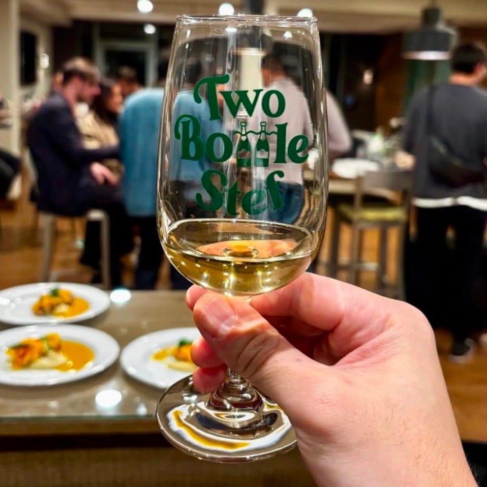
I used the same font from my Two Bottle Stef stickers (shoutout to Patrick Hamilton who designed them a couple years ago), but gave it a twist, replacing the Ts in Bottle with two Champagne bottles, crossed by a squiggly line that doubles as a corkscrew connected to the L. Can’t wait to bring these back out in the new year, as Two Bottle Stef (hopefully) continues to blossom and grow!
THE MENU
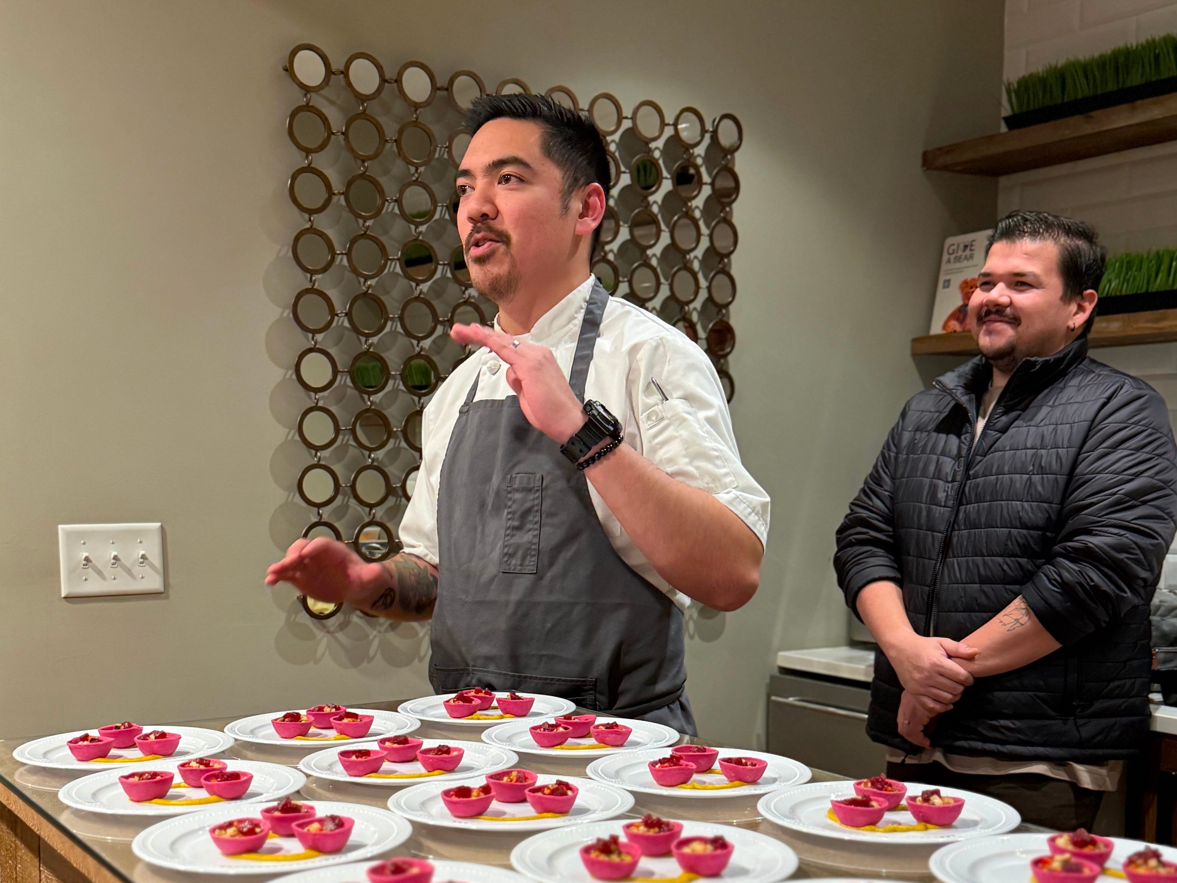
Always a wonderful treat collaborating with chef Cedric Gayon of Five Tastes on a super flavorful menu incorporating the elements of color from my curated works of art. As usual, he knocked it out of the park (!!!) with these incredible outside-the-box courses that truly embodied these colorful pieces. Thank you for working your magic and always keeping cool — even with the kitchen fuses blowing a few times (!!!) throughout the evening. You both rock! 🫶
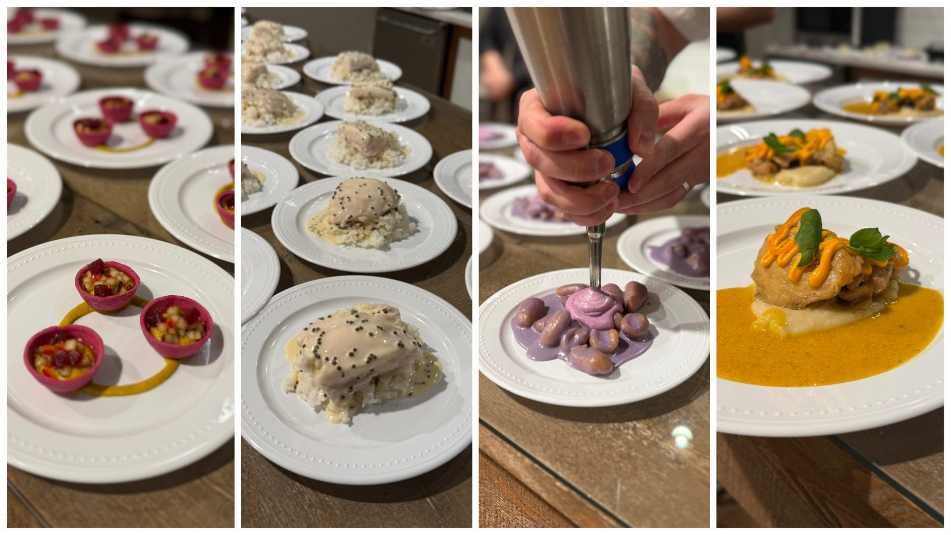
FIRST COURSE: COLOR & MUSIC (Matisse MULTICOLOR)
winter squash tartlet with pear, mushroom, & cranberry
SECOND COURSE: COLOR & MOVEMENT (Herrera MONOCHROME)
poached white fish with caviar cream & jasmine rice
THIRD COURSE: COLOR & EXPANSE (LeWitt BLUE)
Japanese purple potato with butterfly pea & sweet potato gnocchi
FOURTH COURSE: COLOR & DANCE (Haring YELLOW)
chicken yellow curry with carrot, potato, & fresno
CHEESE & CHARCUTERIE (O’Keeffe PINK)
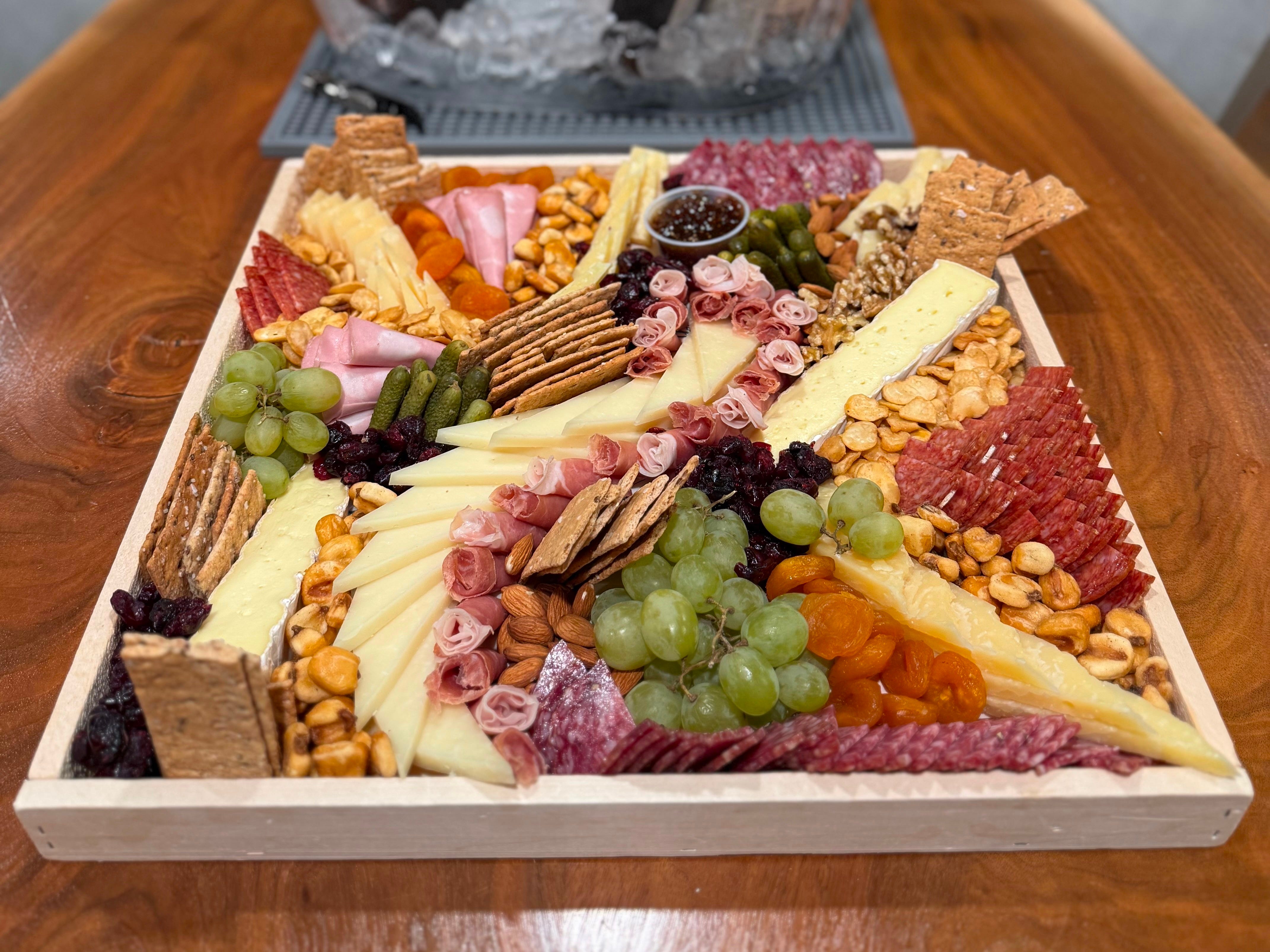
Grand platter from Van Hook Cheese & Grocery (serves 20-24) — I specially requested some of my current favorite cheeses: Sneek gouda from Frisian Farms, Piave, and a creamy brie.
DESSERT: COLOR & PASTRY (PRISMATIC)
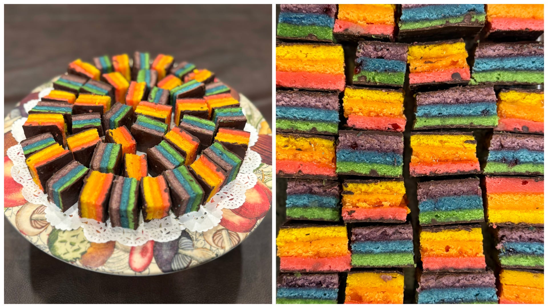
seven-layer rainbow cookies (made by me; recipe from Smitten Kitchen) featuring “ROY” with apricot preserves & “G. BIV” with raspberry preserves
THE WINEUP
/ December 12, 2025 @ Paulus Hook, Jersey City /
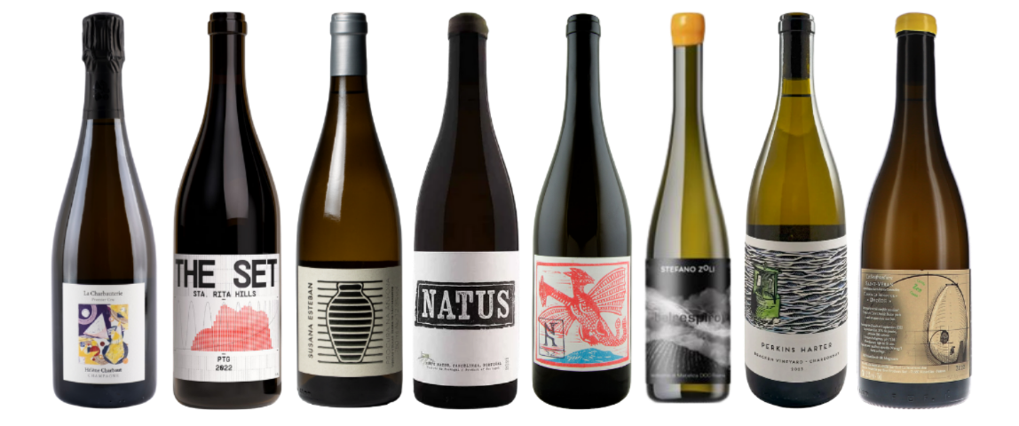
Hélène Charbaut NV Champagne ‘La Charbauterie’ Premier Cru Extra Brut
Flatiron Wines
Polaner Selections (New York) | 🇫🇷 sparkling white
Chardonnay / Pinot Noir / Pinot Meunier
Henri Matisse + Les Codomas ・ brioche toast in triangles ・ playful start
The Set 2022 ‘PTG’ Sta. Rita Hills
Leon & Son Wine
Stelle Wine Co. (New York) | 🇺🇸 still red
Pinot Noir / Gamay
Georgia O’Keeffe + Music, Pink and Blue No. 2 ・ Haw flakes ・ snackin’ swill
Susana Esteban 2023 Alentejo Branco ‘Procura Na Ânfora’
Leon & Son Wine
Grossberg/Kopman Selections (New York) | 🇵🇹 still white
various indigenous varieties
David Hockney + The Pool (2021) ・ amphora ace ・ creamy mouthfeel
Natus 2022 Vinho Regional Alentejano ‘Branco’
Leon & Son Wine
Grossberg/Kopman Selections (New York) | 🇵🇹 still white
Doña Blanca (Roupeiro) / Antão Vaz / Verdelho (Gouveio)
Yayoi Kusama + Shells (1989) ・ lemon-lime fizz ・ herb harmony
Kolonia 52 2021 ‘Plazma’
CoolVines Jersey City
Jenny & François Selections (New York) | 🇭🇺 still white
Juhfark / Furmint / Hárslevelű / Welschriesling
Ellsworth Kelly + Train Landscape ・ electric reduction ・ a touch of skin contact
Stefano Zoli 2022 Verdicchio di Matelica Riserva ‘Belrespiro’
Leon & Son Wine
Stelle Wine Co. (New York) | 🇮🇹 still white
Verdicchio
Etel Adnan + Mount Tamalpais (1985) ・ landscape of Marche ・ crystalline & herbaceous
Perkins Harter 2023 Chardonnay Bracken Vineyard
Flatiron Wines
Vom Boden (New York) | 🇺🇸 still white
Chardonnay
Piet Mondrian + Broadway Boogie Woogie ・ zip-zip-hooray! ・ mineral orchard
Domaine de la Soufrandière 2022 Saint-Véran ‘La Bonnode Ovoïde Cuvée Zen’
Leon & Son Wine
Corkhoarder (New York) | 🇫🇷 still white (1.5L, magnum)
Chardonnay
Carmen Herrera + Untitled (1952) ・ round & ethereal ・ energetic tension
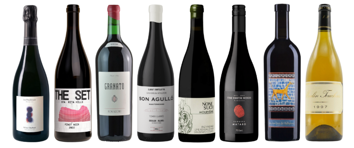
Hélène Charbaut 2021 Champagne ‘Les Pinailleuses’ Premier Cru Extra Brut
Flatiron Wines
Polaner Selections (New York) | 🇫🇷 sparkling white
Pinot Noir
Mark Rothko + Blue and Grey ・ meditative & silky ・ Champagne for Pinot lovers
The Set 2022 Pinot Noir Sta. Rita Hills
Leon & Son Wine
Stelle Wine Co. (New York) | 🇺🇸 still red
Pinot Noir
Helen Frankenthaler + Tutti-Frutti ・ field blend of Pinot clones ・ ripe yet light
Foradori 2016 Vigneti delle Dolomiti ‘Granato’
Leon & Son Wine
Bowler Wine (New York) | 🇮🇹 still red
Teroldego
Sol Lewitt + Loopy Doopy (Blue and Purple) ・ charming & contemplative ・ pomegranate pal
Ca’n Verdura 2021 Binissalem-Mallorca ‘Son Agulló’ Mantonegro
CoolVines Jersey City
De Maison Selections (New York) | 🇪🇸 still red
Mantonegro
Agnes Martin + Starlight ・ salty & smoky chocolate ・ elegant old vines
Nonesuch Wines 2017 Mourvèdre Enz Vineyard
Court Liquors
🇺🇸 still red
Mourvèdre (Mataro)
Keith Haring + The Dance (1992) ・ ethereal yet fruity ・ light on its feet
Tim Smith 2022 Mataro Barossa Valley
Flatiron Wines
Little Peacock Imports (New York) | 🇦🇺 still red
Mourvèdre (Mataro)
Maya Hayuk + North Adams, Mass ・ meaty Mataro ・ savory & herbal
Domaine Didier Dagueneau 2020 Vin de France ‘Les Jardins de Babylone’ Moëlleux
Astor Wines
Polaner Selections (New York) | 🇫🇷 dessert white
Petit Manseng
Wayne Thiebaud + Cakes (1963) ・ ageworthy asset ・ tropical acacia
Moulin Touchais 1997 Coteaux du Layon
Flatiron Wines
Polaner Selections (New York) | 🇫🇷 dessert white
Chenin Blanc
Hilary Pecis + Bakery Display (2025) ・ vibrant vintage ・ thirtyish going on thirteen
THE CODA
Something I forgot to mention that inspired this tasting from the very beginning was the phenomenon of synesthesia, the beautiful cross-wiring of the senses where sound might be seen in color, or taste might conjure shape. While I don’t claim to be a synesthete, I’ve always been fascinated by how our sensory experiences overlap, particularly in the ways that color, flavor, and emotion interplay.
This idea became an important undercurrent to the entire Color Theory tasting: could a wine “taste” like a shade of blue? Could the structure of a painting “feel” like acidity? Each pairing was a playful, intuitive attempt not to explain the wines or artworks definitively, but to open new ways of perceiving them side-by-side. Like a brushstroke that echoes a texture on the palate or a chord that brings a color to mind, synesthesia reminds us that our senses don’t live in silos — and neither do stories.

Unwittingly, two of the artists I had highlighted, Georgia O’Keeffe and David Hockney, have experienced synesthesia during their lifetime. That realization felt like an uncanny confirmation of the instincts guiding this tasting. O’Keeffe’s Music, Pink and Blue No. 2 was born from her desire to translate sound into color, treating painting as a visual equivalent of music, while Hockney has often spoken about experiencing color through rhythm, movement, and light.
In both cases, their work reflects a natural permeability between the senses: seeing sound, feeling color, translating experience across mediums. Knowing this, the Color Theory tasting feels less like a conceptual overlay and more like a shared language: wine, art, and perception all operating in a space where margins soften and one sense seamlessly informs another.

As I was learning more about the artists featured in Color Theory, I encountered a quote from artist and poet Etel Adnan that deeply resonated with me: We write to taste life twice, in the moment and in retrospect. It struck me how beautifully this idea reflects not only my approach to storytelling through wine, but also the very ethos of this tasting. Each bottle, like each artwork, holds an impression of a moment (think: a place, a harvest, a hand).
Curating them side-by-side invited us to re-experience sensation through a new lens. Just as Adnan transformed landscapes into meditative fields of color drawn from memory and feeling, this tasting sought to dissolve the boundaries between perception and emotion as well as pigment and palate. Reflecting on these pairings now, I’m reminded that curation is a way of tasting life twice: first in the act of creating, and again in the act of sharing, both during the event and here on Substack.
As I wrap on Color Theory, I’m realizing that color, like wine, isn’t merely something we see or sip, but something we feel. What began as a study in chromatic language became a meditation on sensation, memory, and the narratives we carry between them. Whether through the synesthetic visions of the artists or the layered complexities of the wines, this experience revealed that perception is never static; it’s fluid, deeply personal, and constantly shifting. This tasting wasn’t about matching flavors to paint swatches, but about experiencing the emotional resonance that both color and wine can evoke.

And I’d be remiss not to acknowledge the community that continues to nourish this work: the vibrant, generous, ever-curious wine lovers of Jersey City, whose presence has added new hues to my life’s palette. In the space between canvas and glass, with their energy woven into every sip, we discovered, à la Adnan’s wisdom, new ways of tasting life: again, and again.
If you enjoyed this Substack post, please consider:
tapping ❤️ below
tapping 💬 and share your thoughts
subscribing to The Decanterbury Tales
Cheers,
Stefie aka ‘Two Bottle Stef’ 💁🏻♀️✌️🍾